

You know the feeling. You've just finished designing a brand-new Power BI report. Every KPI is accounted for, all the data is properly represented, and your job is technically done. But when you step back and take a wider look, the report just looks… boring. A row of KPI cards, a couple of bar charts, a line chart, and maybe a donut if you were feeling daring. It's technically more valuable than a spreadsheet, but the data doesn't pop the way you wanted it to.
I've felt this before. The fix isn't to abandon the classic BI visuals, because there is a good reason why each one is so widely used, and every stakeholder already knows how to read them. The real solution is to add a few lesser-known visuals to your toolkit, ones that spice up the report while still displaying your data in a way that gives viewers real insight. Here are four that can turn a report from boring to fascinating.
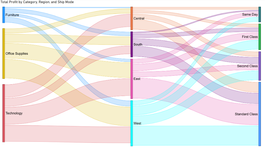
The Sankey chart visualizes flow through movement and color, and it's one of the most visually striking charts in the Power BI toolkit. It shows how a metric moves from one dimension to another in a way that feels intuitive to interpret, letting viewers trace the flow with their eyes almost instinctively.
One caveat: this chart isn't native to Power BI. You'll need to grab it from the Power BI Marketplace before you can use it.
Reach for a Sankey when the story is about movement between categories, not just totals, like tracking how something flows from one stage or group to another. Anytime the question is "where did this go" rather than "how much of this," the Sankey earns its keep.
This is a classic way to elevate a line or bar chart that shows how a metric evolves over time. A waterfall chart shows how a starting value is pushed up or down sequentially. Think of it as the chart equivalent of a running balance, where each bar picks up right where the last one left off, typically colored by whether it was an increase or a decrease.
The beauty of this chart is that it communicates more clearly what most users actually want from a date-based line or bar chart: how much a metric has increased or decreased over time, and where those swings happened.
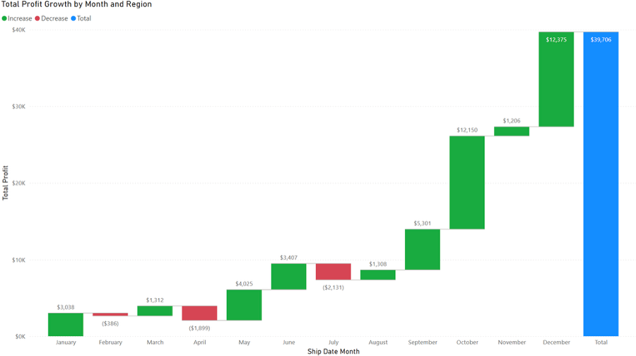
This is the right chart whenever leadership wants to know why a number ended up where it did, not just where it ended up. If someone is going to ask, “What happened in between?” build a waterfall.
This is a chart type I ignored for far too long. Power BI markets it as an AI-powered visual, but it's just as useful when deployed manually by an analyst. You start with a single aggregated metric, then let the user break it down by whichever dimensions matter most to them.
Where the Sankey and waterfall charts are built to tell a predetermined story, the decomposition tree is built for exploration, handing the analysis over to the viewer. Its biggest downside is that it needs a decent amount of space to work well.
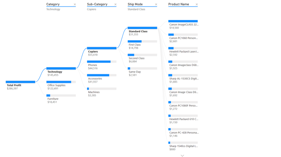
This visual truly shines whenever different stakeholders are going to ask different questions of the same number, letting each person choose their own path instead of forcing you to build a separate chart for every possible cut. It's also a natural fit for root-cause style questions, where the answer depends on drilling into the right combination of dimensions.
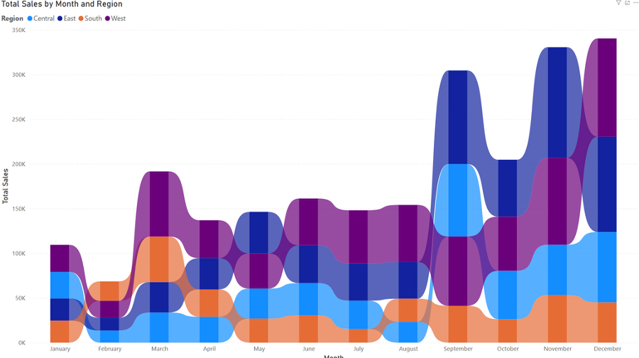
At first glance, the ribbon chart looks just like a standard bar chart, but the ribbons connecting each segment from one period to the next are what give it another dimension. The ribbons show rank changes over time, so instead of just seeing how big each category is in a given month, you see who's winning and who's losing ground relative to everyone else.
Reach for a ribbon chart when rank matters as much as raw value, like tracking which product line stays on top from quarter to quarter or watching how regions trade places over the course of a year. If the interesting part of the story is who's in first place or how a given product rises and falls over time, a ribbon chart tells it better than a normal stacked bar ever could.
None of these visuals are meant to replace the classics. What they do is bring a new angle and style to your reports, breaking up the sameness that creeps in after your tenth KPI dashboard. Deployed correctly, they add depth to a report and leave a real impression on your users. Next time you're building a report and something feels like it's missing, give one of these four a try.

Not sure on your next step? We'd love to hear about your business challenges. No pitch. No strings attached.


