The American Gaming Association predicts that Americans will place $1.76 billion on Super Bowl LX bets this year, and that’s only what is legally tracked. You may even partake in the friendly, backyard betting that takes place at households nationwide. If that’s the case, the Concord Analytics practice has some data points you may want to review.
Maybe. Historically speaking, the team wearing a white jersey wins more than 70% of the time. Of the non-white colors, red tends to dominate.
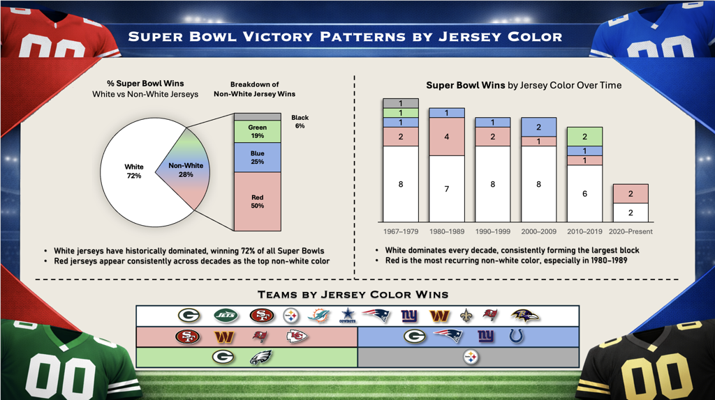
This visualization was created in Tableau by Personalization Strategist Dhatri Ambati.
“Raw data from the Gridiron Uniform Database was structured in Excel, using pivot tables to segment wins by color, era, and team. These insights were then used to identify key performance patterns and build the final dashboard,” Ambati said.
Overall, Super Bowl teams tend to perform slightly better when they travel less. There are all sorts of reasons this correlation may exist. Perhaps it’s a homefield advantage. Perhaps it's similar weather patterns. Maybe it’s just less time on a plane. What’s especially interesting about the Seahawks – Patriots matchup is that the location gives the edge to the Patriots who historically perform well with longer travel.
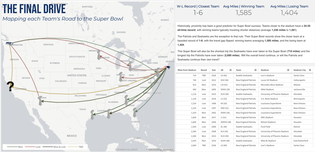
This visualization was created in Qlik by Business Intelligence Analyst Matt Jenkins.
“I built a multi-layered Qlik Sense map using data from Pro Football Reference, supplemented by Gemini for historical and geographic details,” Jenkins said. “Using the Data Load Editor, I concatenated location data to accurately plot travel paths, displaying team logos and the Lombardi Trophy via URL-based images. To finish, I used a Layout Container to overlay custom branding and an HTML legend on a pale map base, keeping the focus entirely on the data story.”
We have historically predicted 29 games to be over and 29 games to be under, so given our historical record, popular opinion may be the least useful factor in your sports betting with few correlations to lean into.
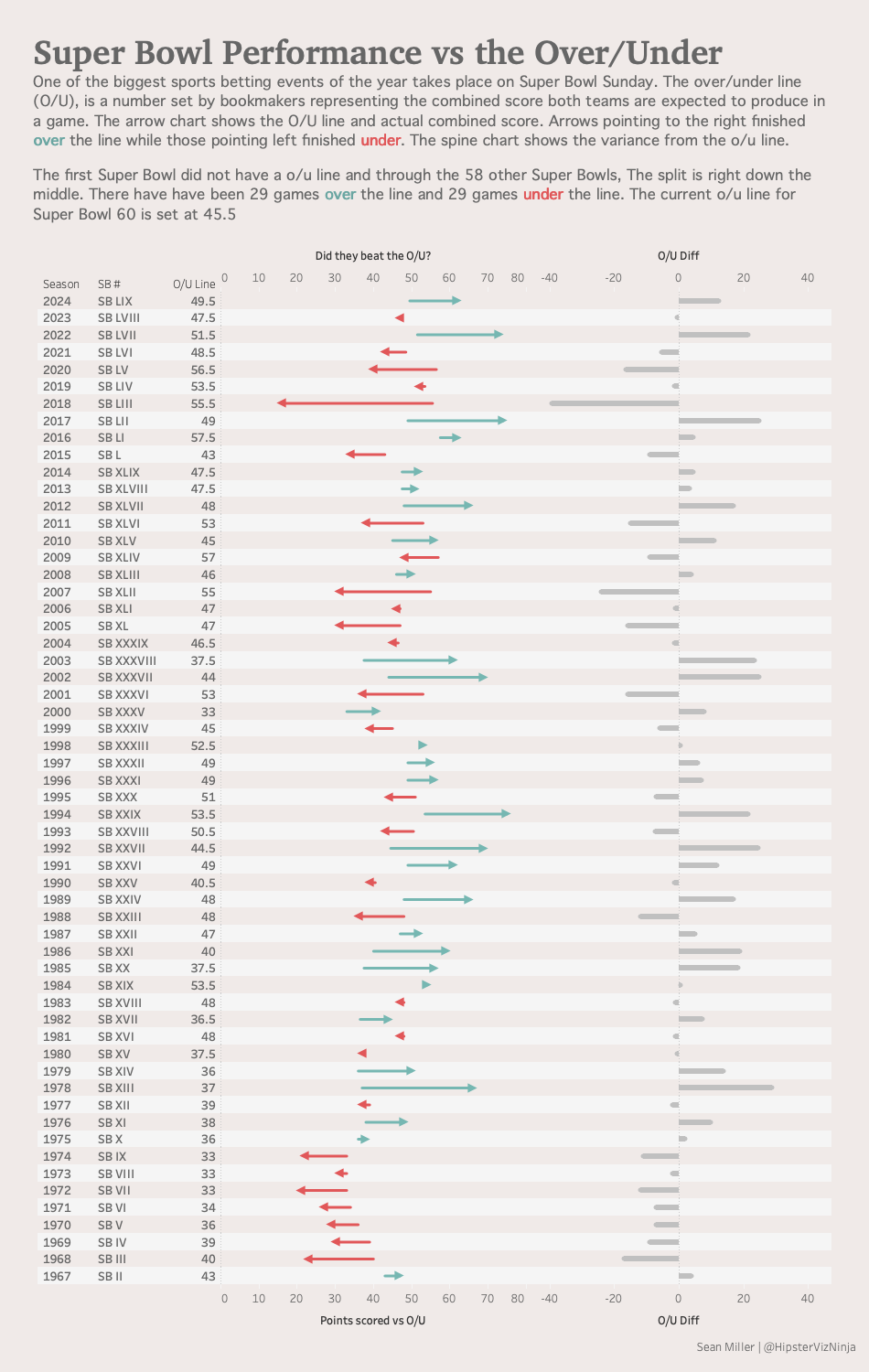
This visualization was created in Tableau by Tableau Visionary Sean Miller.
“I created this long-form dashboard using data from SportsBettingDime to investigate how accurate the over/under line has been over time. The arrow chart is built using Tableau gantt chart type and custom shape mark types. I added a secondary axis to show the variance between the line and final total score with a common baseline for easy scanning,” Miller said. “I really enjoy seeing this data presented this way because we can immediately see the ouliers, namely the 2018 Super Bowl against the Patriots and the Rams. These two teams came into the game with two of the most explosive offenses in the league that season. Everyone assumed this would be a very high-scoring game, but it was, in fact, the opposite.”
While the Super Bowl analyses our team put together on a slow Tuesday may not make you rich from sports betting, our team’s bread and butter work providing Business Intelligence and Predictive Analytics will provide a positive ROI for your business.

Not sure on your next step? We'd love to hear about your business challenges. No pitch. No strings attached.


