
Note: This analysis and these dashboards were written on March 26, 2026. The insights here reflect the tournament field as of that date.
Every March, the same ritual plays out across offices, living rooms, and group chats around the country. Brackets are created with gut feelings, overreactions, and school loyalties. Cinderellas shatter dreams. Number one seeds fall to double-digit underdogs. And by the time the Final Four rolls around, almost nobody's bracket is still intact.
But what if there was a better way to look at it?
This year, our Business Intelligence team decided to apply the same data-driven insights we bring to our client work to the most chaotic sporting event in America. The result is four dashboards that go beyond bracketology, pulling from advanced analytics, historical patterns, and efficiency metrics to ask the question everyone pretends to have an answer to: who is actually going to win the 2026 NCAA Championship?

The first dashboard, built by Sean Emmerson, tackles a question that every fan argues about endlessly: in a direct matchup between any two teams, who would win?
"Every year people debate matchups based on vibes and highlights.,” Sean explains. “I wanted to build something that actually answered that question with data—looking at all Division 1 teams going back nearly two decades."
To power this analysis, Sean drew from KenPom and Torvik, two of the most respected sources of advanced college basketball analytics, covering every Division I team from 2008 through 2026.
The Matchup Madness dashboard lets you select any two of the 350+ Division I programs across any year in that range to generate a side-by-side analytical comparison. It calculates a predicted point spread using a range of advanced metrics from Torvik rankings to show which team holds the statistical edge in each category.
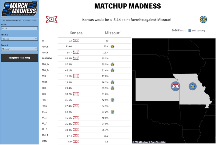
For the 2026 season, a sample matchup between Kansas and Missouri illustrates how the tool works: Kansas holds the advantage in Wins (22 vs. 20), Adjusted Defensive Efficiency (94.7 vs. 103.4), Turnover Rate (15.6% vs. 17.8%), and Defensive Rebounding Rate (30.2% vs. 31.6%).
The model projects Kansas as a 5.14-point favorite in that matchup based on advanced efficiency metrics.
The dashboard doesn’t just show who should win—it shows why, giving analysts, coaches, and even casual fans a holistic view for understanding team composition and competitive edges that box scores alone cannot.

The second dashboard, also built by Sean Emmerson, takes a step back from individual matchups to look at the bigger historical picture: which programs have consistently made it to the end of March?
"I wanted to visualize not just those that made the Final Four, but where those programs are geographically, how many times they've been there, and what their best finish was within the constraints of our sample data,” Sean says. “When you put it on a map, patterns you'd never notice in a standard table become clear."
The interactive map plots every program to reach the Final Four between 2008 and 2025. Each team’s location is marked with its logo and color-coded by their best finish: gold for champions, silver for runners-up, and blue for Final Four appearances. The size of each bubble corresponds to the number of appearances, so programs with sustained success stand out immediately.
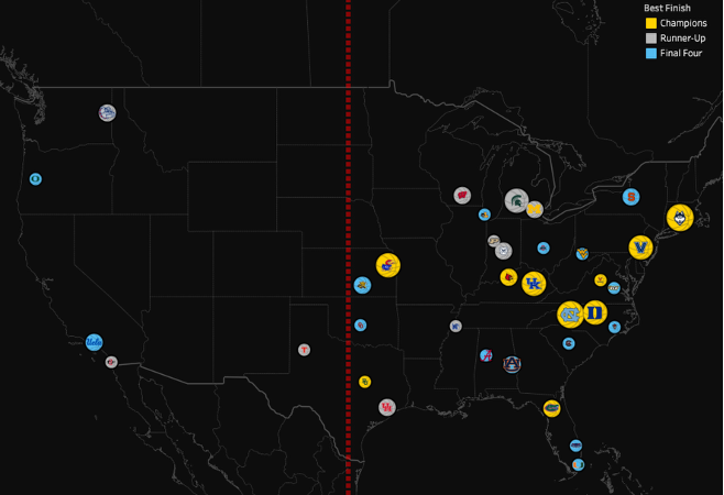
The geographic story is striking. Championship teams cluster heavily on the eastern side of the United States. The line in the visual below falls exactly on the geographic center of the contiguous U.S. No team west of that line has won a championship after 2008. In fact, the last team to win west of that line was Arizona in 1997.
In addition to the geographic visual, the map highlights the most dominant programs of the past two decades by the size of their bubble. Moving from west to east, Kansas, Kentucky, North Carolina, Duke, Villanova, and UConn clearly dominate. The map makes a compelling visual argument: Final Four success is not evenly distributed—it is highly concentrated among a small number of eastern schools.
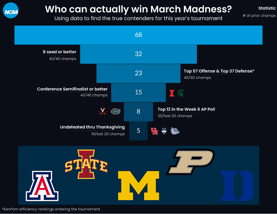
The third visual, built by Jamal Zlitni, takes a fundamentally different approach. Rather than predicting outcomes, Jamal developed a rules-based elimination framework, a funnel built on historical championship patterns that systematically removes teams that history suggests cannot win it all.
“To identify the True Contenders for the 2026 NCAA Men's Tournament, I created a funnel to isolate the champion from the field,” Jamal explains. “I chose to combine data-backed team statistics, such as KenPom efficiency ratings and conference tournament performance, with more nuanced light-hearted filters. Layering these criteria, I narrowed the field to a shortlist of five teams.”
Running the current tournament field through these filters, Jamal’s dashboard surfaced five teams with a legitimate path to the title: Arizona, Iowa State, Michigan, Purdue, and Duke. At the time of writing, all five are still alive in the 2026 tournament.
Teams with logos next to a funnel level indicate where they were filtered out. This logic was validated by Florida: the only 1-seed excluded from the shortlist, they suffered an early exit in the Round of 32.
“The insight that intrigued me the most from this data was the Week 6 AP Poll Rule: for 20 consecutive years, the eventual champion has been ranked in the Top 12 of the Week 6 AP Poll,” Jamal notes. “This suggests that while March Madness feels chaotic, the DNA of a champion is almost always visible to experts before the holiday season even begins.”
Jamal chose to build the dashboard in Sigma because of its flexible design environment. “Sigma’s report view allowed me to easily overlay components and tell a story on the canvas,” he said. “While I personally have Arizona cutting down the nets, I’ll be monitoring teams outside this subset to see if any can defy the KenPom or AP Poll laws that have governed the last two decades of play!”
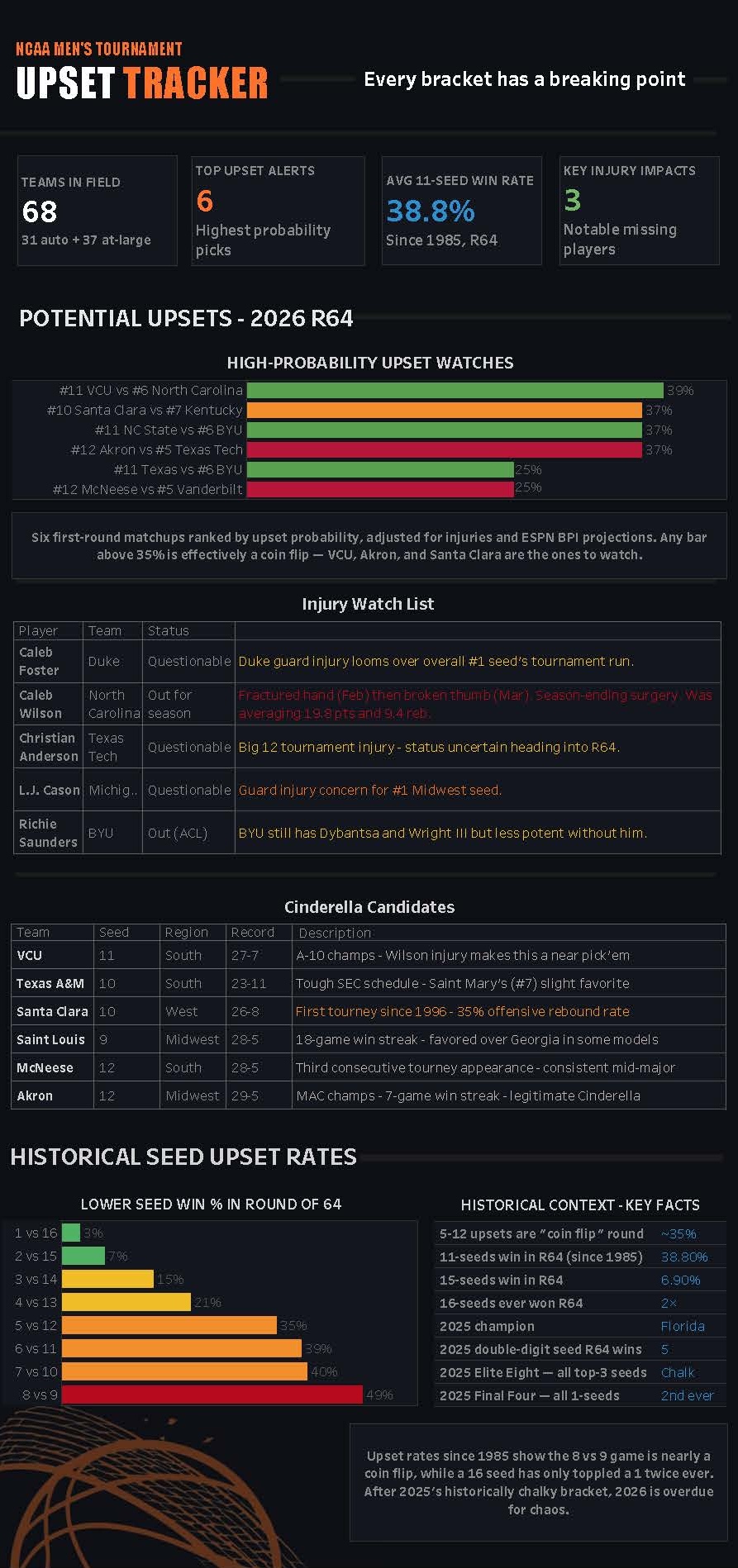
In the fourth visual, Michelle Vega built a Tableau dashboard focused on one of the most compelling storylines in sports analytics: upsets in the NCAA Men’s Basketball Tournament.
“March Madness generates more bracket activity than almost any other sporting event in the country, yet most people still make their picks based on gut feel rather than data,” Michelle explains. “I wanted to create a dashboard that gives viewers a clear, visual way to understand where upsets are most likely to happen—and why.”
Her dashboard includes four metric tiles that summarize the tournament landscape at a glance, followed by two core visuals:
“I chose this topic because it sits at the intersection of something people genuinely care about and a meaningful analytical story, one that data can tell far better than intuition alone,” Michelle says.
March Madness will always have upsets. It will always have its chaos. That’s the point. But beneath the unpredictability, there are patterns—in team construction, program history, and the metrics that separate pretenders from contenders.
These dashboards highlight what Business Intelligence uncovers at its core: we do not aim to eliminate uncertainty; instead, we equip you to navigate it more intelligently. Whether you are analyzing a Kansas vs. Missouri spread, mapping two decades of Final Four geography, exploring where upsets are most likely, or running a field of 68 teams through a set of championship filters, the data tells a story that pure intuition cannot.
If you want to uncover patterns like these in your own data and turn complexity into clarity, Concord can help. Contact us to see how our team of experts brings actionable insight to your most challenging questions.

Not sure on your next step? We'd love to hear about your business challenges. No pitch. No strings attached.


