
Report design is often the first thing stakeholders want to cut when timelines get tight. They push for functionality, data accuracy, and speed. While those elements are critical, the reality is that users judge a book by its cover. A dashboard that looks professional and intuitive builds immediate trust. If the layout is messy or the visuals look dated, users are less likely to engage with the data, no matter how efficient the DAX is behind the scenes.
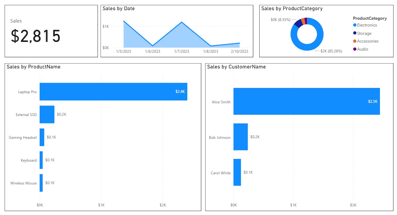
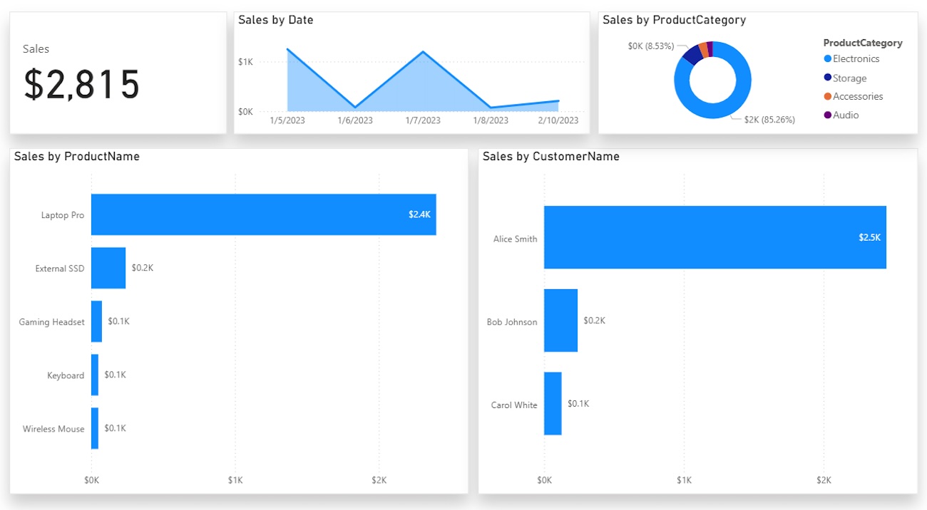
Before we apply any changes, let's look at where we are starting. This is a functional report, but it feels flat and rigid.
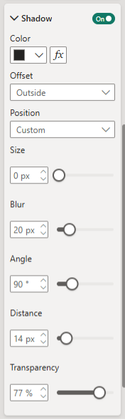
Depth is an excellent way to separate visuals, but you have to be careful. The default shadow settings in Power BI are often too harsh. They can make the report look cluttered rather than organized. To get a modern, professional look, we need to adjust the configuration so the shadows add dimension without being overbearing.
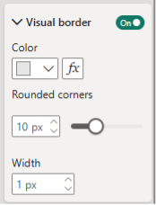
Go to the Format pane, enable Shadow, keep the Offset as 'Outside', and change the Position to 'Custom'. Use the following specific settings:
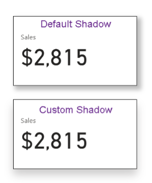
You can see the difference immediately. The default shadow (top) is bold and distracting, while the custom setting (bottom) provides a subtle lift that adds dimension without screaming for attention.
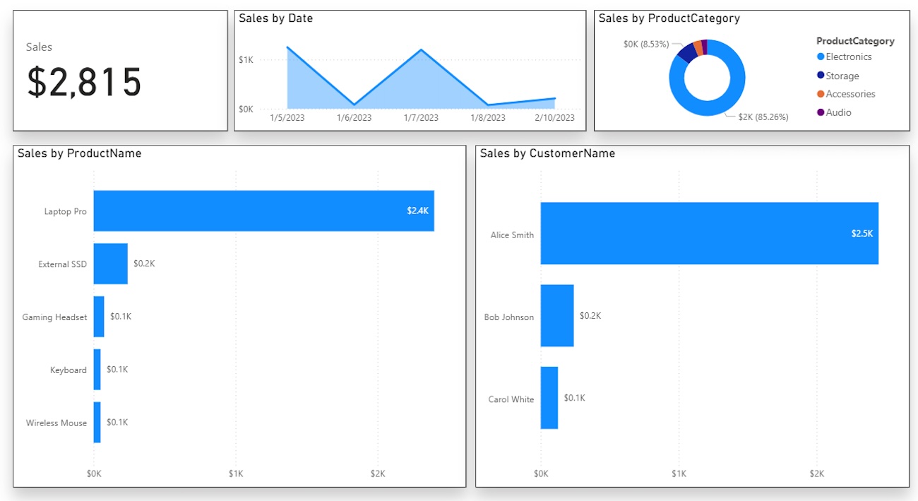
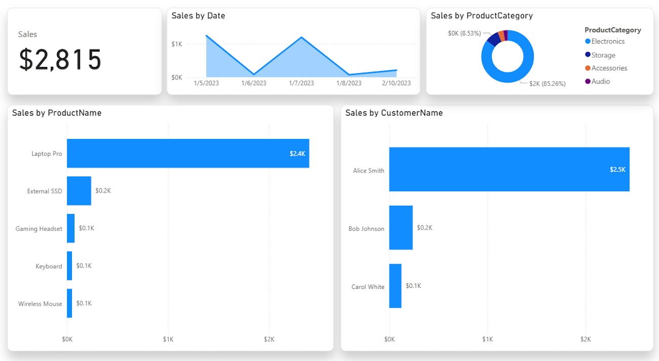
Here is how the report looks with these shadows applied to all containers.
Next, let's look at borders. Shadows are a good start, but many developers default to solid black borders. These can be very harsh and create too much visual noise. A light grey border frames the visuals nicely without dominating the canvas.
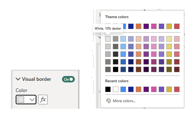
Standard Power BI visuals are rectangular by default. While this works, it can feel blocky and rigid. Rounding the corners slightly adds a modern aesthetic and softens the overall feel of the dashboard. You don’t need extreme curves; a small adjustment goes a long way.
White visuals on a white page can cause elements to blend together. We want to draw the user's eye specifically to the data containers. A light colored background creates just enough contrast to make the white containers pop.
You want a color that is visible but not distracting. Here are three hex codes that work well:
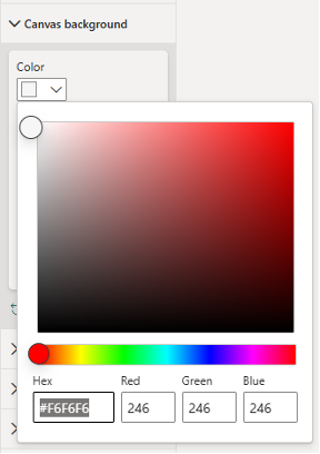
Changing the canvas background to #F6F6F6 separates the containers from the page structure.

For comparison, look at where we started versus where we finished. The data hasn't changed, but the perceived value of the report has increased significantly.
These changes take only a few minutes to implement but drastically improve the user experience. By refining your shadows, softening your borders, and adding background contrast, you ensure your stakeholders focus on the insights rather than the layout.

Not sure on your next step? We'd love to hear about your business challenges. No pitch. No strings attached.


