I remember when this challenge dropped.
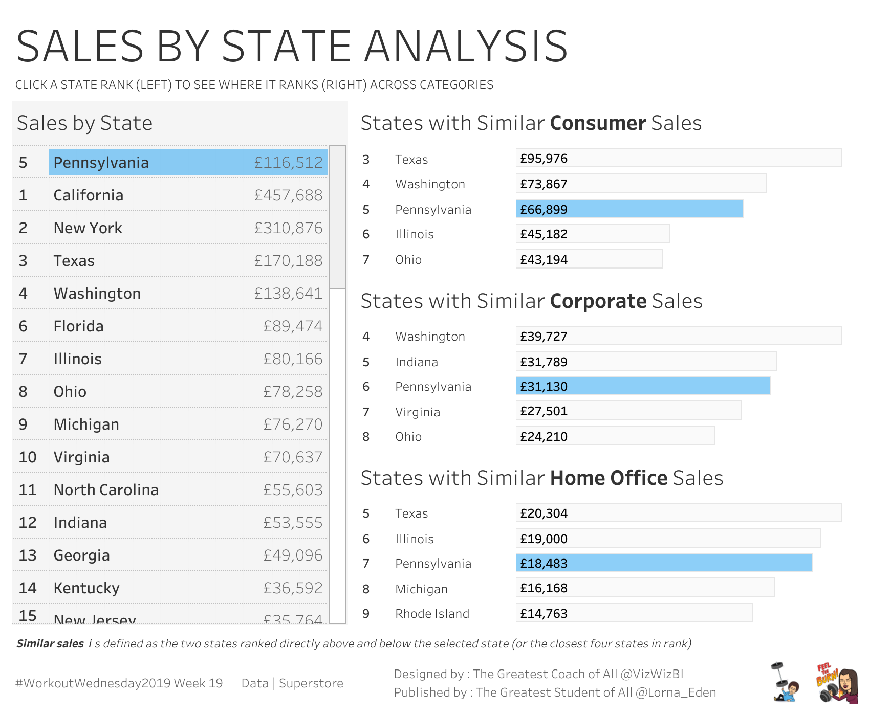
It was May 2019. Andy Kriebel had returned as a guest coach for the week with Lorna and just published WOW Week 19 and the prompt looked... easy? A bar chart of Superstore states by sales. A parameter to pick a state. The selected state highlights, and the chart shows your pick plus the two states ranked above and below it. 15 bars total.
I cracked my knuckles and said something like, “This’ll take twenty minutes.” (It did not take twenty minutes.)
Two hours later, I had a viz that worked but felt over-engineered. I’d ranked the states, ranked the differences from the selected state’s rank, then used RANK_UNIQUE of those differences to keep the closest two. It got the right answer—sometimes—and it had way more moving parts than it needed. I shipped it, somebody in the comments politely pointed out that I could throw away half my logic, and I went, “Oh.”
That “oh” moment is the rep. Let me walk you through it.
Type-along version: a single bar chart of states by SUM(Sales). One string parameter labeled “Choose a State.” When you change the parameter:
Pick Mississippi, and you see Mississippi plus its two rank neighbors on either side. Pick California, and the entire field shifts so California sits in the middle of a new set of five. Same chart. Five bars. Every time.
When stakeholders ask, “Where do I rank?”, they mean, “Who’s right above me?”
If you’ve ever shipped a 50-bar chart to an executive and gotten back a request to “filter just to my region,” this is the rep that solves that. You give them the parameter. They tell you who they want to see themselves next to. The chart updates. The conversation moves on.
I’ve shipped this exact pattern in healthcare benchmarking (facility vs. peer cohort), sales rep leaderboards (rep vs. their nearest peers in revenue), and retail store comparisons (store vs. its closest neighbors in same-store sales). Different data, different domain, same four calcs.
Let’s build it. I’m working in Sample - Superstore. You can follow along with any dimension that has a measure to rank by.
Drag State to Rows and SUM(Sales) to Columns. Sort descending. You should be staring at fifty bars right now. (Forty-nine if you don’t have D.C. Superstore doesn’t.)
That’s the foundation. Everything else gets layered on top.
Right-click in the data pane → Create Parameter. Name it Choose a State. Set it up like this:
Set a default to whatever state you want. (Lorna’s default is Mississippi.)
Right-click the parameter → Show Parameter so it lives on the canvas. We need to interact with it while we build.
This is the highlight engine.
Returns TRUE for whichever state matches the parameter and FALSE for everything else. Drag it to Color. Your selected state is now a different color than the other forty-nine.
That’s the highlight handled. On to the filter.
Standard table calc. Each state gets a numeric rank from 1 (highest sales) to 49 (lowest).
You don’t need to put this on the canvas yet, but you need it as a building block for the next calc. After you create it, right-click → Compute Using → State so the rank is computed across the State dimension.
This is the move. The whole technique pivots on it.
Read what that does. The inner IF returns the Rank value only on the row where Is Selected State is TRUE. Every other row returns null. The outer WINDOW_MAX then broadcasts the single non-null value across the entire partition. So every state, on every row, now knows the rank of the state the user picked.
That’s the broadcast pattern. A WINDOW_MAX (or WINDOW_MIN) of an IF that is null everywhere except once is one of the most useful patterns in Tableau. You will reuse it constantly. Once it clicks, you will see places to apply it everywhere.
Now every state has a number, the absolute distance in rank from the state the user picked. The selected state itself has distance 0. The state one rank above has distance 1. One below also has distance 1, and so on.
Here’s where I overcomplicated it for two hours when I first built this.
You want five bars: the selected state plus two above and two below. The instinct is to rank the differences themselves and keep the top five with RANK_UNIQUE. That works, but you don’t need it.
The clean move is to filter on the absolute distance directly:
That’s it. Why does that give you five bars?
Because the selected state has distance 0. The state one rank above has distance 1. The state one rank below also has distance 1. Cap at 2, and you get one self plus two rank neighbors per side, which equals five bars. The math is 2N + 1, where N is your filter cap. Want seven bars? Cap at 3. Want twenty-one? Cap at 10.
That’s the rep. Four calcs, one filter, five bars that follow your parameter wherever it goes.
Three things to watch when you ship this.
Same partition, every calc. All three table calcs (Rank, Rank of Selected State, Difference from Selected) need to compute on the same partition, usually State. If your partition is set wrong on one of them, the filter behaves like it’s haunted. Click each table calc in the Marks card, hit Edit Table Calculation → Compute Using → Specific Dimensions → State, and double-check.
Highlight not following the parameter? Almost always the same fix: Is Selected State got pulled to Detail instead of Color. Drag it back to Color. Done.
Tied sales values. If two states have identical SUM(Sales), which is rare with currency and more common if you migrate this pattern to integer counts, they will share a Rank and therefore share a Difference from Selected. Both will pass the filter together, which can push you to twelve bars instead of eleven on certain selections. If that matters in your context, switch the filter to use RANK_UNIQUE on the difference and keep ≤ 11. For most stakeholder dashboards, the tied-bars case is a non-issue.
Here’s where I’ve actually shipped this pattern in client work.
Sales. Rep leaderboards. “Where do I rank against the reps in my territory, and who’s right above me?” The parameter is the rep’s name. The chart shows their context. They walk into 1:1s with their manager pointing at it.
Healthcare. Facility benchmarking. “How does my hospital compare to peer facilities of similar size and patient mix?” The parameter is the facility ID. (Cohort filtering — same size, same payer mix, etc. — usually happens upstream of this pattern. The Rep 1 logic is the spine; cohort filters are the skeleton it hangs on.)
Retail. Store performance. “Which stores are closest to mine in revenue, and what are they doing differently?” The parameter is the store. The leaderboard becomes a learning tool, not just a ranking.
Marketing. Campaign comparison. “Where does this campaign sit against the last six I’ve run, and which were its neighbors?” The parameter is the campaign ID. Same engine. Different stakeholder language.
Same four calcs. Same fifteen bars. Different dataset, different stakeholder, different conversation.
If your team is staring at a fifty-bar chart and wishing it talked back, this is exactly the kind of pattern WOW Live works through.
WOW Live is a custom Workout Wednesday session I run virtually with your team using your data, your stack, and your team’s questions. The Rep 1 pattern shows up in almost every session because almost every team has a “where do I stack up” dashboard somewhere. We’ll build it on your data, in your environment, with your team’s actual benchmarking questions.
This is Rep 1 of 5. Up next is Rep 2 — Line Charts That Tell a Story, Lorna’s WOW2023 Week 25 — the one with the auto-annotation that does its own decrease and percent-decrease math between two date parameters.
The whole series lives at the Workout to Workday hub. Bookmark it.
Until next time, GO FORTH AND VIZ.
— Sean
—
Sean Miller is Principal Consultant for Analytics & BI at Concord, based out of his awesome hometown of Kansas City. He blogs at hipstervizninja.com and somehow ended up doing #WorkoutWednesday for nine years running. (Don't judge.) Find him on Tableau Public as @hipstervizninja.

Not sure on your next step? We'd love to hear about your business challenges. No pitch. No strings attached.


