A few months after Lorna dropped WOW2023 Week 25, I was on a client call when a stakeholder asked the question every BI consultant has heard at some point in their career.
“What was the % variance between [x date] and [y date]?”
The line chart was right there on the screen. He could see both points. The Y-axis values were even labeled. But that’s not what he was asking. He wanted the arithmetic done for him. “Down 14%. Down $230K. Tell me the number.”
I had two choices: open Calculator, or remember Lorna’s challenge from a few weeks earlier and do it inside the chart.
I did the second thing. The chart annotated itself. He nodded, said “that’s what I needed,” and we moved on. (Credit where it’s due: Lorna’s challenge was inspired by Jacob Rothemund’s Netflix vs. Spotify historical stock-price viz, which sits in the workbook attribution. Smart pattern, well-traveled.)
That’s the rep. Let me show you how it works.
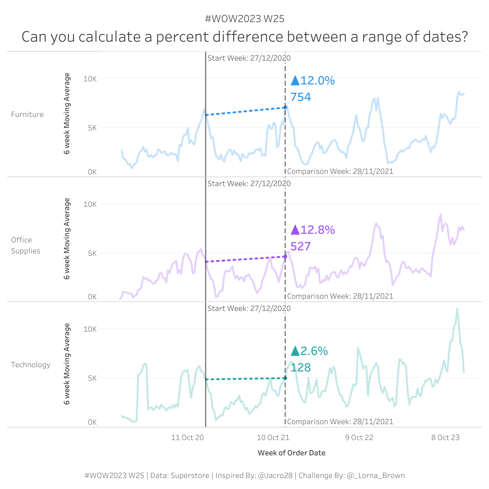
A weekly sales line chart with two date parameters, Start Week and Comparison Week, and a label on the chart that automatically shows the dollar change and percent change between those two weeks.
When you change either parameter:
No annotation tool. No manual text box. No “let me update the slide deck before the meeting.” Just a chart that tells its own story between whichever two weeks you point at.
Executives don’t want a line chart. They want the story in the line chart.
Every time I’ve delivered a line chart with four worksheets and three filters, the next meeting has included a request to “just tell me what changed between these two points.” That request has a calc-shaped answer.
Two parameters, two window calcs, one chart. You hand them the chart, and they hand themselves the story. I’ve shipped this pattern in retail (week-over-week revenue between key dates), HR (headcount drift between two pay periods), customer success (NPS movement between two surveys), and finance (forecast variance at month close). Different data, same engine.
Let’s build it. Sample - Superstore again, weekly Sales.
Drag DATETRUNC('week', Order Date) to Columns (continuous) and create a 6-week moving Sales Avg on Rows.
A six-week trailing average. Drop it as a measure on Rows. Suddenly your line chart has both signal and smoothing. (Skip this one if you’re under time pressure. The auto-annotation is the rep. The moving average is the bonus drop set.)
Create two parameters. Both type Date, allowable values Range, and lock the range to the start and end of your actual data so users can’t pick weeks that don’t exist.
Default them to two weeks far enough apart to be testable. Show both parameters so they live on the canvas while you build.
This is the calc that plants the marker. (One small note before you create it — Lorna names this calc the same as the parameter on purpose. I’m following her convention so the workbook reads cleanly. You’ll have a parameter called Start Week and a calculation called Start Week. They’re different things; Tableau treats them as different things; just be aware.)
Read what that does. On every row in the chart, this calc checks whether that row’s week matches the Start Week parameter. If yes, it returns the SUM(Sales) value for that week. If no, it returns null. So this calc is null on every row in the line chart except one: the row matching the parameter.
Same pattern, second parameter:
Now you’ve got two measures. Each is null on every row except the one matching its respective parameter. Drag both onto Detail. Tableau will plant a mark on each non-null row — your two markers, automatically positioned wherever the parameters point.
Here’s where Rep 1’s WINDOW_MAX broadcast pattern comes back in a different jersey.
Each of those two measures is null on 99% of the rows in the partition. To do arithmetic on them, you need to broadcast the single non-null value across the whole partition. WINDOW_MAX does that.
If you read Rep 1, you saw WINDOW_MAX(IF [bool] THEN [value] END) used to broadcast a rank across a partition. Same idea here. The single non-null value gets broadcast everywhere so arithmetic can find it. It’s the same pattern applied to a different problem. Once it clicks, you’ll see it everywhere.
Drag Decrease and Percent Decrease to Label. Format Decrease as currency and Percent Decrease as a percentage. Adjust the label position so it sits somewhere that makes sense — usually near the Comparison Week marker.
That’s it. The chart now annotates itself. Move either parameter, the label updates. Move the line chart off-screen and bring it back, the label is still right there.
Two things to watch.
Annotation goes blank. Almost always the parameter date isn’t in your data. Lock the parameter range to your actual min/max date range; otherwise users pick a Tuesday and the calc finds no week-row to match.
WINDOW vs. LOD. I get asked this a lot: why aren’t you using a FIXED LOD here instead of WINDOW_MAX? You can, but the WINDOW pattern is faster on this shape of data, computes lazily after filters, and reads more cleanly in the calculated field editor. LODs are great. So are window calcs. Use the right tool. (I don’t have data to back this up, but I think 80% of dashboards I review reach for an LOD where a WINDOW calc would be cleaner. Worth questioning the reflex.)
Retail. Week-over-week revenue. “What changed between launch week and this week?” Two parameters: launch date, this week. The chart tells the story without a deck slide.
HR. Headcount drift between two pay periods. “How did we trend from Q1 close to today?” Same engine, swap in headcount instead of sales.
Customer Success. NPS movement between two surveys. “Is the satisfaction gap closing or widening?” Two surveys equal two parameters. The chart annotates the delta.
Finance. Spend trend between month-ends. “What’s the variance from forecast to actuals at close?” Two anchor dates, one auto-annotation. The variance number lives inside the chart.
Same two parameters. Same broadcast trick. Different stakeholder, different conversation.
If your execs are asking “can you rerun this for [random date range]” during your dashboards, and you’re grabbing your TI-83 to do the math, this is the rep that fixes that pattern.
WOW Live is a custom Workout Wednesday session I run virtually with your team using your data, your stack, and your team’s questions. The auto-annotation pattern shows up in almost every executive review dashboard your team will ever build. We’ll wire it into one of yours, on your data.
This is Rep 2 of 5. Rep 1 — Bar Charts That Show Context is live if you missed it (and if you did, go read it — the broadcast pattern there is the same trick we just reused here, in a different domain).
Up next is Rep 3 — Scatterplots Where Time Isn't on the X-Axis — the FIXED LOD pattern that converts calendar time into elapsed time and turns spaghetti charts into cohort curves.
The whole series lives at the Workout to Workday hub.
Question I’d love to hear from you: what’s a chart in your environment where your stakeholders are doing the math manually every week? That’s exactly the kind of thing this rep is for.
Until next time, GO FORTH AND VIZ.
— Sean
—
Sean Miller is Principal Consultant for Analytics & BI at Concord, based out of his awesome hometown of Kansas City. He blogs at hipstervizninja.com and somehow ended up doing #WorkoutWednesday for nine years running. (Don't judge.) Find him on Tableau Public as @hipstervizninja.

Not sure on your next step? We'd love to hear about your business challenges. No pitch. No strings attached.


