.jpg)
Nine years ago, I clicked publish on my first #WorkoutWednesday submission. But that one hour of fighting it taught me three things: one about a calc I'd been avoiding, one about the community I showed up to, and one about why this whole exercise was secretly making me a better Tableau developer on every dashboard after.
Nine years later, I'm still doing it. And the pattern that has shown up over and over—the reason I'm putting this whole series on the Concord blog—is this: the techniques you fight hardest for in a Wednesday workout are the exact techniques that earn the most respect and kudos in your Tuesday demo meeting. Workout to workday. That's the bridge. That's why this exists.
This post is the hub. It introduces five techniques I've personally pulled out of the WOW archives and dropped into client work the next week. One post per rep. And one offer at the bottom for teams who want to do this with their own data.
Let's warm up.
For anyone outside the #datafam: quick orientation.
Workout Wednesday is a weekly community challenge that started back in 2017. Andy Kriebel and Emma Whyte kicked it off, Luke Stanke and Ann Jackson jumped in, and Lorna Brown has been one of the longest-running co-leaders of the project. The format is simple: every Wednesday somebody publishes a viz. Your job is to look at that viz, follow the requirements, and rebuild it—pixel for pixel, calc for calc.
That's it. That's the whole thing. And it sounds small, until you actually try it.
What you're really doing is reverse-engineering somebody else's brain. "How did they get that highlight to follow the parameter? How did all four of those line charts end up on the same scale? How is that table calc not breaking?" You sit there. You stare. And then it hits you. And then you build it. And then you publish. Somebody messages you with, "Hey, you can do that with one less calc," and you learn that too.
Nine years of those Wednesdays. The five reps below are the ones that have paid for themselves the most times in client work.
Five bars. One parameter. The selected state plus its two nearest neighbors above and below—every time. From Lorna Brown's #WorkoutWednesday 2019 Week 19.
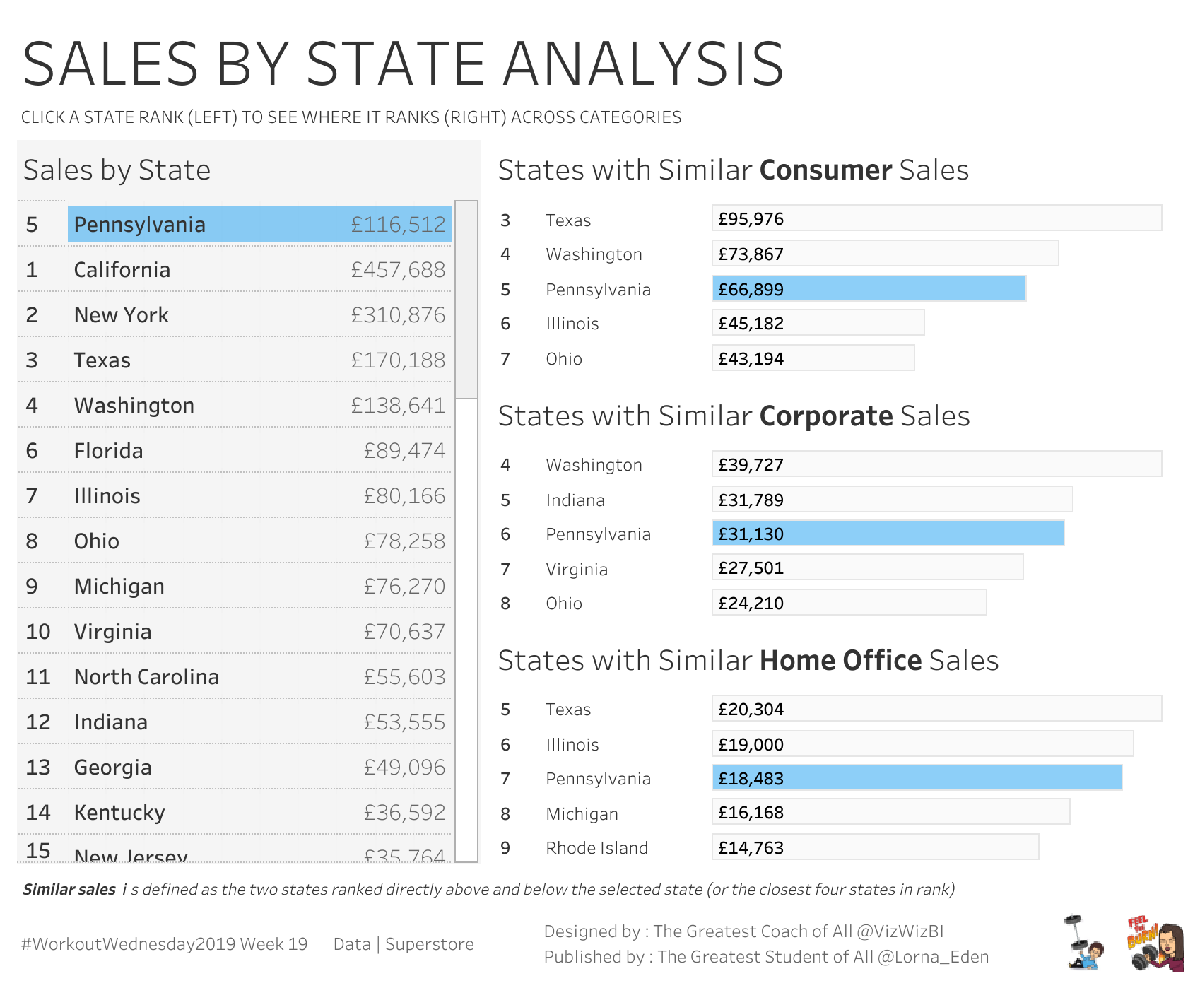
This is the rep where stakeholders stop asking, "Where do I rank?" and start asking, "Who's right above me?" Same dataset, different framing—and that framing is the entire trade. One chart, infinite contexts. I've shipped this exact pattern in healthcare benchmarking, sales rep leaderboards, and store-level comparison dashboards.
Two date parameters, two markers, and a label that does its own math—your line chart annotates itself. From Lorna Brown's #WorkoutWednesday 2023 Week 25 (inspired by Jacob Rothemund's Netflix vs. Spotify stock comparison viz).
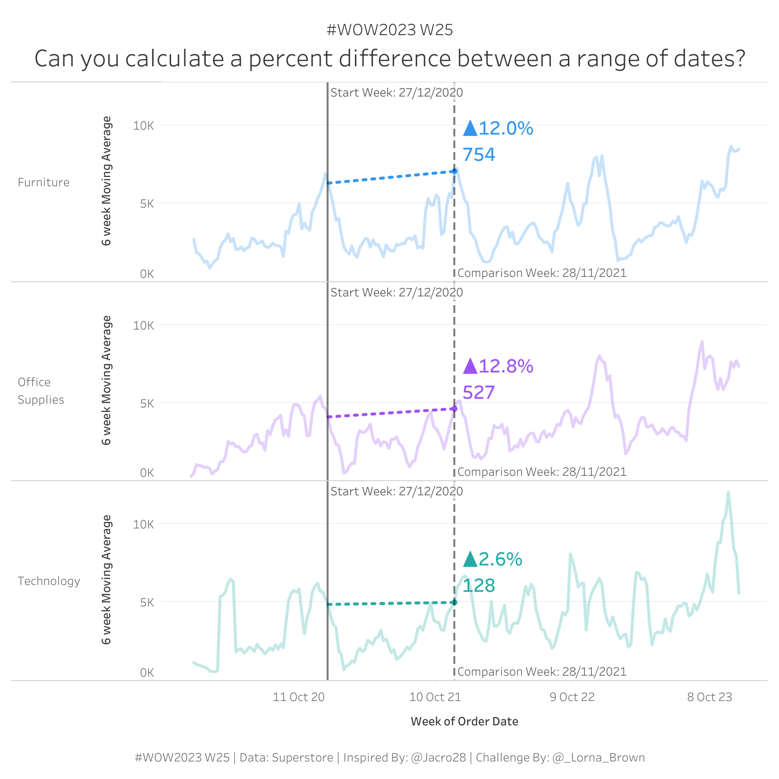
Executives don't want a line chart. They want the story in the line chart. This rep is how you give it to them without seven worksheets, three filters, and mental math. Two parameters, two WINDOW_MAXs, one label. You hand them the chart, and they hand themselves the story.
Anchor every line to its own day zero with a FIXED LOD. Calendar time disappears. Cohort patterns appear. From #WOWstreams; a personal challenge I published in 2021 using my own Spotify history.
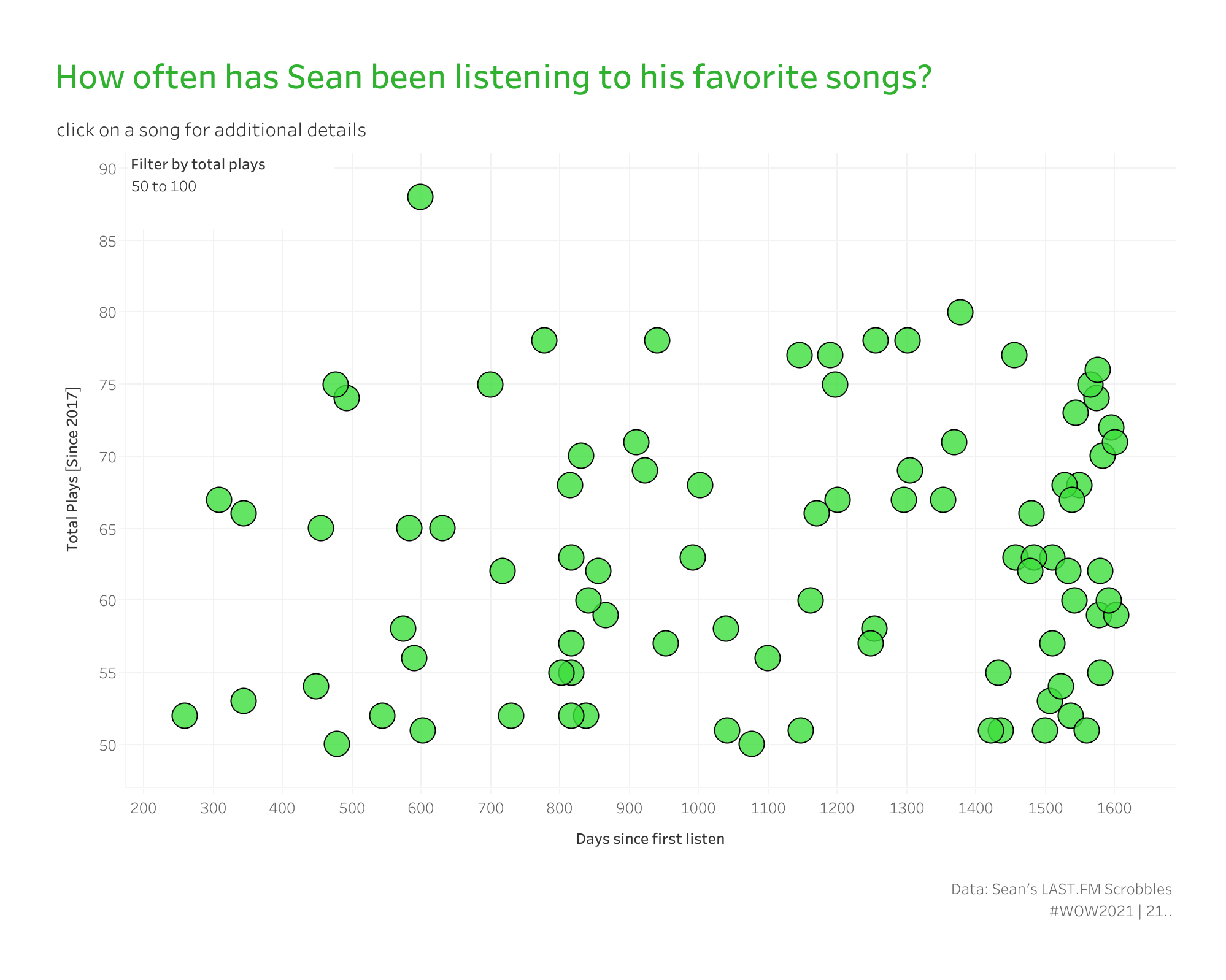
The chart is about songs. The pattern is about cohorts. Replace "song" with "customer," replace "first listen" with "signup date"—same chart, different SaaS deliverable. I've used this exact pattern for customer activation curves, support ticket lifecycle curves, and onboarding completion curves.
One nested LOD pins every chart to the same Y-axis. Containers do the rest of the work. From Brad Werner's #WorkoutWednesday 2020 Week 53 (inspired by Rody Zakovich's Container Fun viz).
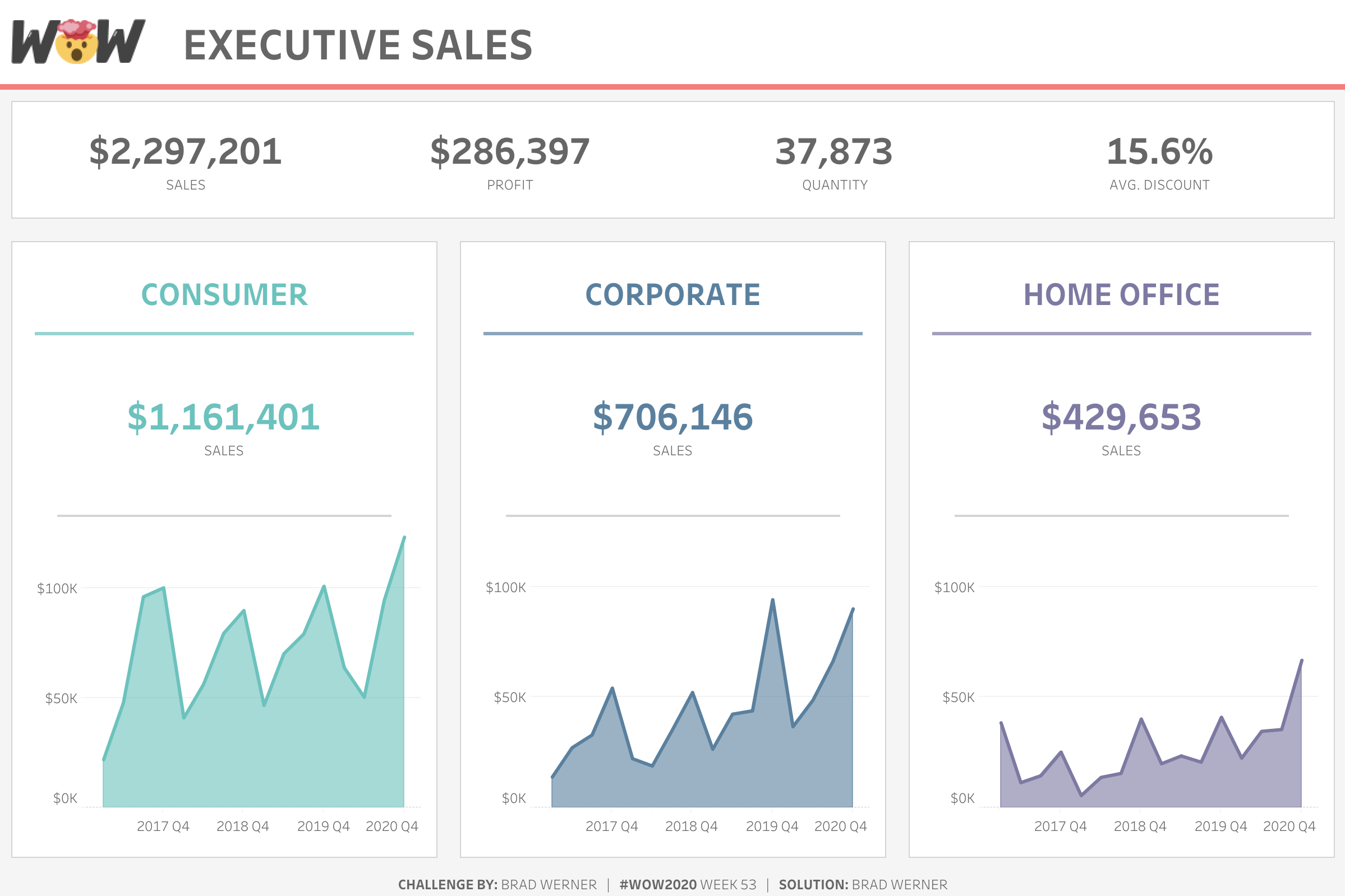
This is the dashboard that taught me containers. Past tense. Definitive. The structural discipline in this rep has saved me more billable hours than any other technique on this list. The nested LOD that gives every line chart the same Y-axis ceiling is, frankly, a thing of beauty.
A parameter action with a Reset sentinel. Click to filter. Click again to go back. Stakeholders never get stuck. From Filter actions and DZV; a 2026 build of mine using Superstore.
Filter actions are great until somebody clicks somewhere unexpected and the dashboard goes empty. Parameter actions, with a sentinel reset value, make "all" a deliberate state instead of an accident. This rep has saved me more "the dashboard is broken" support tickets than I can count; every one of them was actually a stakeholder who'd clicked through and didn't know how to get back.
Here's the offer (this part's new; I announced it for the first time at TC 2026).
It's called WOW Live.
I'll come to your team virtually and run a custom Workout Wednesday workshop using your data, your stack, and your team's questions. Same five-rep structure as the talk. Different jersey.
The workbooks we build are not Superstore; they're yours. The patterns we teach are not generic; they're the ones your team will actually ship next quarter. Healthcare cohort curves on your patient data. Sales rep leaderboards on your CRM data. Container layouts grafted onto the existing dashboards your execs already see every Monday.
It's a private session. Your data. Your team's questions. You walk out the other side with workbooks, cheat sheets, and a playbook tuned to your environment.
→ Sign up for a 45-minute WOW Live Planning Session
The first cohort runs through Summer 2026, and spots are limited because I'm running them myself.
Happy vizzing; and GO FORTH AND VIZ.
— Sean
—
Sean Miller is Principal Consultant for Analytics & BI at Concord, based out of his awesome hometown of Kansas City. He blogs at hipstervizninja.com and somehow ended up doing #WorkoutWednesday for nine years running. (Don't judge.) Find him on Tableau Public as @hipstervizninja.

Not sure on your next step? We'd love to hear about your business challenges. No pitch. No strings attached.


