
In 2021, I exported my entire Spotify listening history.
Not for any particular reason. I was curious. I’d been playing the same Metallica record on repeat for about a month and wondered if that was actually a pattern in my listening or just a recency effect. The CSV was 80,000 rows. I dropped it into Tableau and started digging.
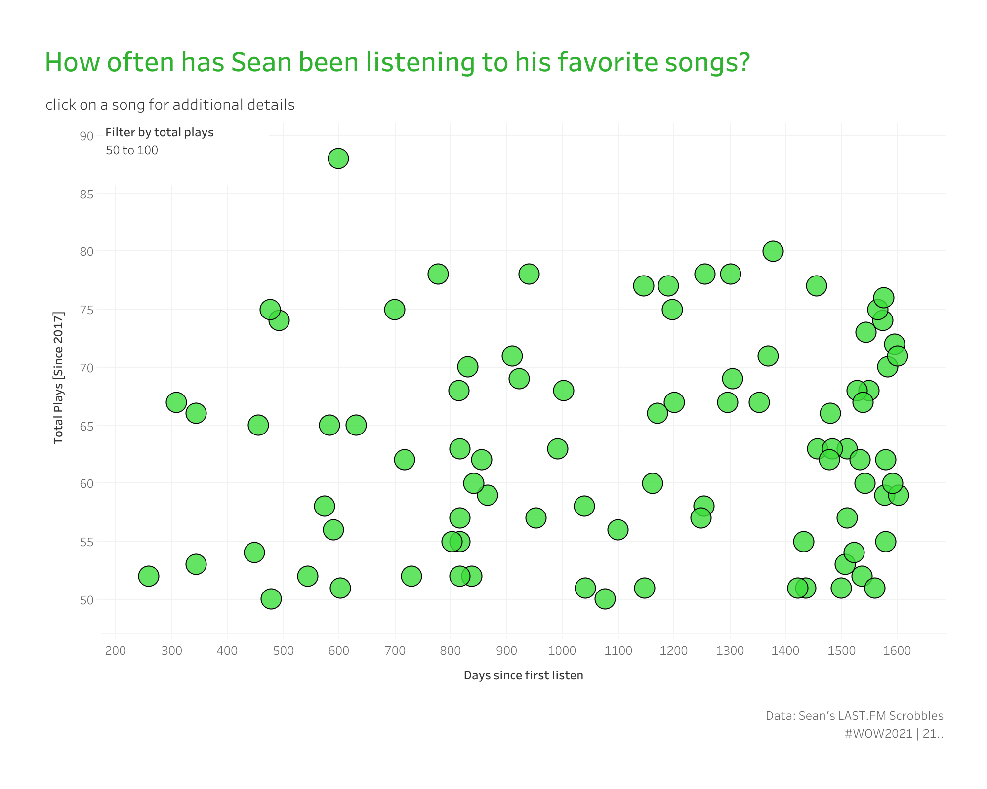
The first chart I built was a calendar-time line chart. One line per song. It looked like every spaghetti chart you’ve ever seen on Reddit. Useless. Beautiful in a “this is just visual noise” way, but still useless.
Then it hit me: the X-axis is wrong. I didn’t care when I’d listened to a song in calendar terms — I cared how a song’s relationship with me had grown over its own lifetime in my library. Some songs are sprinters. (Camila Cabello’s “My Oh My”—30 plays in 38 days, then steady state from there.) Some are slow burns. (Imagine Dragons’ “Believer”—160 plays over 1,515 days, ramping up over six months until it became one of my most-played tracks ever.)
The chart that surfaced that pattern needed an X-axis of days since first listen, not calendar date. And to get there, I needed to anchor every song to its own day zero.
That’s the rep. And it ports cleanly into every cohort analysis a SaaS company has ever wanted to do. Let me show you.
A connected scatterplot where:
Songs from 2017 and songs from 2024 both start at day zero on this chart. The visual collapses calendar time and surfaces shape — fast climbers, slow burns, one-and-dones, steady state.
Anytime you compare cohorts, lifecycles, onboarding journeys, ramp curves, or post-signup behavior, calendar time is the wrong axis. You don’t want to compare what customers did in March. You want to compare what customers did in their first 30 days, regardless of when they signed up.
Same chart pattern. Replace “song” with “customer.” Replace “first listen” with “signup date.” Replace “plays” with “logins,” “revenue,” or “support tickets resolved.” The cohort curve was sitting there the whole time. You just had to anchor every series to its own day zero.
I’ve shipped this pattern in SaaS (customer activation curves), support (ticket lifecycle), onboarding (completion curves), and marketing (channel ramp curves). Same two FIXED LODs. Different domain, different headline.
When we get to interactivity, we’re going to do that with a set action, and we need a set to do that. Right-click on SongID, scroll to Create, click Set, name it Selected Song, and do not add any values to the set. We’ll do that later.
For every Song ID, this returns the date of that song’s earliest play. Pinned per entity. It doesn’t move when you filter by date range, and it doesn’t change when you adjust chart granularity — it’s anchored to the song.
In a SaaS context, this is { FIXED [Customer ID] : MIN([Signup Date]) }. Same pattern, different field. The whole rep pivots on this calc.
For every play (or login, or ticket event), this calculates how many days have passed since the first play of that specific song.
Drop this on Columns and set it to continuous. Your X-axis is now an integer representing “elapsed days into this entity’s relationship with the metric” — not a calendar date.
We need to create the window function that calculates our running sum.
A running cumulative count of plays per song. Yes, I realize the dot part could have been a TOTAL() function, but we’re going to use this again later, so it makes sense to repurpose it. Drop this on Rows.
This is a table calculation, and the direction matters more than anything else in this rep. After you drop it on Rows:
If you set it the other way — computing across Song ID — your curves go horizontal instead of climbing. (I learned this the hard way around 2 a.m. during the first build.)
From here you’ve got a scatterplot. But the fun part of this challenge is the interactivity. Remember that we have a normalized baseline — we may want to see whether a particular song was a one-hit wonder or an all-time favorite. We need to show the cumulative line trend for that, so we’ll create a similar formula to the one above:
What’s happening here is that, because Cumulative Plays is a window function, it’s already aggregated, and all dimensions referenced in an aggregated calculation must also be aggregated. A set simply evaluates whether a member is part of the selected items or not. So under the hood, it’s a Boolean, and the MAX() of TRUE and FALSE is TRUE because T comes before F alphabetically.
So when the set is TRUE, we’ll get the running sum of plays line chart for the selected song. And we’ll make the selection dynamic with set actions.
Now drop both _dot and _line onto the Rows shelf and sync the axes (because in 2026 this is still not the default).
On Rows, make sure _line is on the left and _dot is on the right.
There’s one more calc that earns its keep — and this is the one I almost left out of the original because I didn’t think I’d need it.
A FIXED count of total plays per song. Drop this on Filters → At least 25 (or whatever your threshold is).
Why? Because if you don’t filter the long tail of one-and-done songs out of this chart, it becomes pure visual noise. With 80,000 rows of data, I have hundreds of songs I played exactly once and never again. They show up as a single dot at day zero with a value of 1. They don’t tell you anything except that I spent a lot of time on YouTube watching the wrong videos.
In a SaaS context, this is the “only show me cohorts with enough data to be meaningful” filter. Cut it at 30 customers, or 100, or whatever your statistical-significance threshold is.
This is where we add some polish to the whole thing. Let’s set up a set action to select any song (this is why we have SongID on Detail in the Marks card). From the menu bar:
Dashboard → Actions → Add New → Change Set Value
That’s it.
Three things to watch:
FIXED runs before dimension filters. This is a feature, not a bug — but it surprises people. If you filter the chart by date range and First Listen doesn’t change, that’s why. The FIXED LOD is computed before your date filter is applied, so the anchor stays put. Which is exactly what you want for cohort analysis. (If you ever need FIXED to respect a filter, add it to Context. But not here.)
Table calc direction. I said it above and I’ll say it again because it’s the single most common mistake I see. Total Plays must compute across Days since first listen, at the level of Song ID. If you set it the other way, the curves go flat instead of climbing. Always sanity-check by hovering over a single song and confirming the running total looks right.
One-row songs draw degenerate lines. If a song has exactly one play, its “line” is a single point at day zero. Some users find this distracting. The fix is the threshold filter from Step 5 — set a minimum count and the noise disappears. Alternatively, you can build a Song ID Line Size boolean ({ FIXED [Song ID]: COUNT([Song ID]) } > 1) and use it to drive Size on the Marks card so single-point songs get hidden.
SaaS. Customer activation curves. “How fast did this cohort hit their first ten logins?” Replace song with customer, plays with logins.
Support. Ticket lifecycle curves. “How long until 80% of new tickets are resolved?” Replace song with ticket, plays with resolution events. Add a Y-axis cap at 100%, and you’ve got a cumulative resolution curve.
Onboarding. Completion curves. “When do users in this segment hit ‘aha’ relative to signup?” Replace song with user, plays with completion events. Color by acquisition channel, and you’ve got a comparison.
Marketing. Channel ramp curves. “How quickly does each channel reach steady-state attribution?” Replace song with campaign, plays with attributed conversions. Color by channel.
The chart is about songs. The pattern is about cohorts. Once you see the FIXED LOD as the anchor that converts calendar time into elapsed time, you’ll find places to use it everywhere.
If your team is staring at a calendar-axis line chart, wishing it could compare cohorts that signed up months apart, this is exactly the workshop you want.

WOW Live is a custom Workout Wednesday session I run virtually with your team, using your data, your stack, and your team’s questions. The cohort-curve pattern is the single highest-ROI rep I teach for SaaS and customer success teams. We’ll build it on your activation data, in your environment, with your team’s actual cohort questions.
This is Rep 3 of 5. Rep 1 — Bar Charts That Show Context and Rep 2 — Line Charts That Tell a Story are both live.
Up next is Rep 4 — Layout: Containers Are the Floor Plan — Brad Werner’s container challenge from 2020, plus the nested LOD that pins every chart in a small-multiples dashboard to the same Y-axis. The structural rep that has saved me more billable hours than any other technique on this list.
The whole series lives at the Workout to Workday hub.
A question I’d love to hear from you: what’s a cohort question your team has been chewing on that calendar-time charts can’t answer? Drop me a line. The answer is almost always, “we just need to anchor every series to its own day zero,” and I’m always happy to sketch the build.
Until next time, GO FORTH AND VIZ.
— Sean
—
Sean Miller is Principal Consultant for Analytics & BI at Concord, based out of his awesome hometown of Kansas City. He blogs at hipstervizninja.com and somehow ended up doing #WorkoutWednesday for nine years running. (Don't judge.) Find him on Tableau Public as @hipstervizninja.

Not sure on your next step? We'd love to hear about your business challenges. No pitch. No strings attached.


