Containers were my white whale until December 2020.
I’d been using Tableau professionally for years at that point, and I still treated dashboard layout like Photoshop — drag a worksheet onto the canvas, eyeball the position, snap it into place, repeat. Floating objects everywhere. Pixel offsets locked in by hand. Resize the dashboard and watch the whole thing fall apart like a Jenga tower.
Then Brad Werner published WOW Week 53. The title was Can you build with containers? The unspoken subtitle was: no, you cannot — but you’re going to try.
I tried. Three times. The first attempt was a mess. The second attempt looked right but blew up when I resized the dashboard. The third attempt — the third one — finally clicked, and from that day on I’ve been a container person. I now believe in containers the way some people believe in horoscopes. Brad’s challenge fixed something in my brain that had been broken for years. (Credit where it’s due — Brad’s challenge was inspired by Rody Zakovich’s Container Funviz, which is the gold standard.)
There are two reps in this one challenge: the layout discipline that survives change requests, and the single nested LOD that makes small multiples actually comparable. Let me show you both.
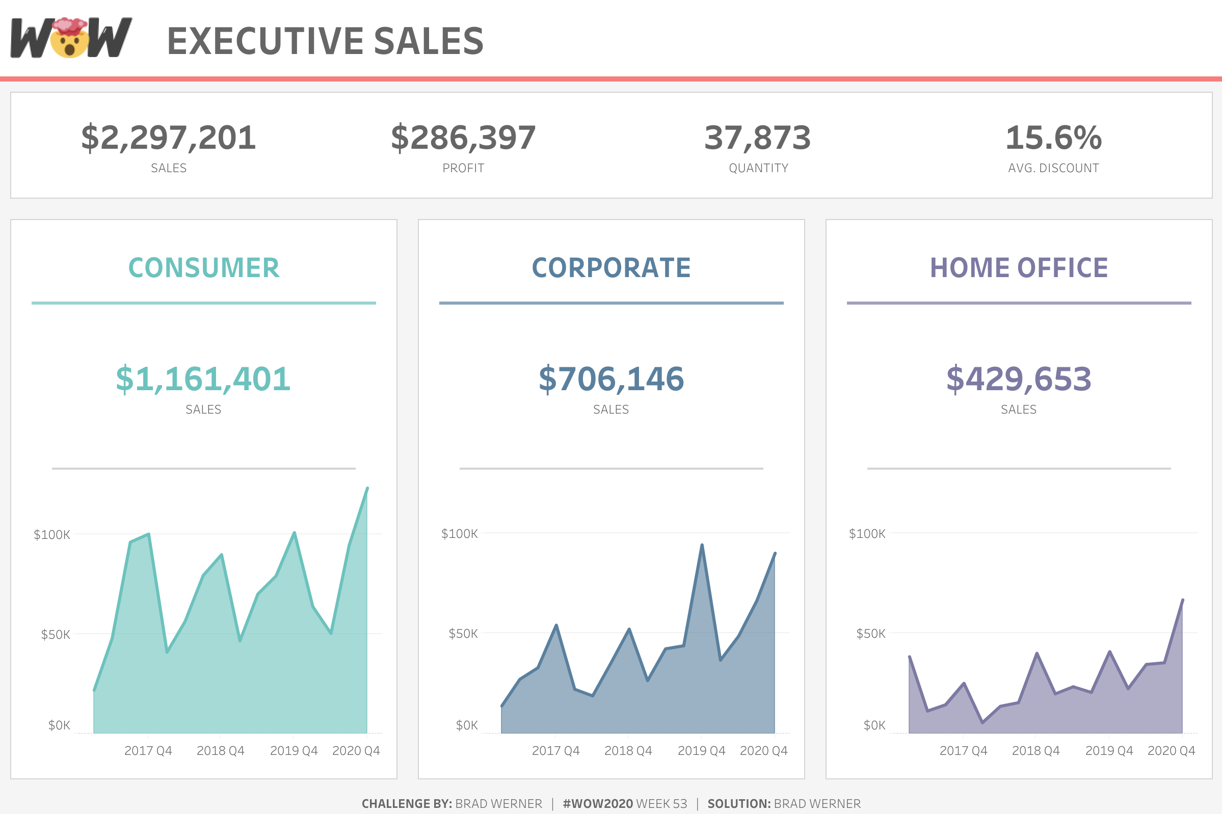
A small-multiples dashboard with three columns — Consumer, Corporate, and Home Office — and for each column: a KPI block on the top, a quarterly sales line chart on the bottom, and an annual sales line chart on the right.
Two big things happen:
When somebody asks, “Can you add a fourth KPI?” or “Can we make the right column wider?” — and they will ask, on every single dashboard, in every single review — you don’t redesign the layout. You change one container property, and every child obeys.
Layout is where most of my client dashboards used to die.
The first version always looked great. Then someone said, “Can we add a fourth segment row?” and the whole grid would go sideways. Or “Can we make the right column wider?” and everything would reflow incorrectly. Or — the killer — “Can we resize this for the boardroom screen?” and floating objects would land on top of each other in ways that made me physically wince.
The fix is structural, not visual. If your dashboard is a stack of horizontal containers inside vertical containers, with distribute-evenly turned on at every level, you can survive almost any change request without manually moving a single thing. (I have no data to back this up, but I’d estimate this discipline alone has saved me 50+ hours of rework in the last three years. Which, billable rate considered, is real money.)
I’ve shipped this exact pattern in executive review dashboards, multi-region operations monitoring, product feature adoption tracking, and finance department spend boards. Same container hierarchy. Same nested LOD. Different domain.
Two parts: the calc, and the layout. Calc first because it’s small and gorgeous.
Read what that does, inside-out.
The inner FIXED computes one number for every combination of segment, year, and quarter — the total sales for that segment-year-quarter cell. So if you’ve got 3 segments × 4 years × 4 quarters, you get 48 numbers.
The outer MAX collapses all 48 of those down to a single value — the highest segment-quarter-sales total anywhere in the dataset.
That single number, broadcast across every row in the partition, is your Y-axis ceiling. Drop it onto each line chart as a constant reference line, and every chart in the dashboard now ends at the same maximum value. The auto-scale lies stop. The visual comparison becomes honest.
Without this calc, each segment’s chart auto-scales to its own range. Consumer’s quarterly peak might be 400K, Home Office’s might be 60K, and your eyes will tell you they’re roughly the same height because they fill the same vertical space. That’s the lie this calc fixes.
This is the most useful nested LOD I write in a typical week of client work. Memorize the shape — { MAX({ FIXED [grain] : [agg] }) } — and apply it anywhere you need a global maximum at a specific grain.
For each segment, build two line charts — one quarterly, one annual. Filter each sheet to its segment. Drop MAX Segment Quarter Sales as a reference line on each of them, set to Constant value, formatted however you like (I usually use a thin dotted line in a muted grey).
You’ll also want a KPI sheet — text marks, Measure Names on Rows, formatted as a clean stat block. Brad’s original had four KPIs per segment row.
1200 × 800. That’s Brad’s original, and it matches a typical executive monitor viewport. If your team is on a different standard (1440 × 900 is common for newer setups), use that — but commit to one size for the whole project so containers behave predictably.
Open a fresh dashboard. Drop a Vertical container as the outer wrapper. Inside it, you’ll add:
Each segment-column vertical container holds:
That’s the whole hierarchy. Nothing floats. No pixel-offset positioning anywhere.
This is the rule that makes the layout self-healing.
For each horizontal container holding the three children, right-click → Distribute Contents Evenly. Tableau will divide the available horizontal space equally among the three children. Resize the dashboard, and the proportions hold.
For the outer vertical container holding the three segment rows, same thing — right-click → Distribute Contents Evenly, and the rows split the vertical space.
Critical gotcha: Distribute Contents Evenly doesn’t inherit. Set it on every container at every level where you want it applied. If a child container doesn’t have it set, that child will keep its fixed dimensions while its siblings stretch.
Pick a padding standard and use it everywhere. I default to:
Apply it to every container. Consistency is what makes the dashboard feel intentional. Inconsistent padding is what makes it feel sloppy, even when the layout is technically correct.
For each of the three vertical containers at the bottom, to achieve the cutout aesthetic, you’ll need to add a thin border and color the background white.
Every sheet’s title gets hidden. Hierarchy comes from the dashboard, not from individual sheets. Add titles, dividers, and section labels as text objects inside the appropriate containers. This keeps formatting decisions in one place (the dashboard) instead of scattered across seven different sheets.
Three things to watch:
A sheet won’t drop into a container cleanly. This almost always means there’s a stray floating object or a “tiled” object that should be inside a container instead. Open the Item Hierarchy pane (View → Show Item Hierarchy) and inspect the tree. If something is at the wrong level, drag it into the correct parent.
Don’t forget to normalize the axis across all sheets. The whole point of the MAX-of-FIXED calc is honest visual comparison across rows. Without it, each chart auto-scales to its own range. Your eyes will believe the charts are comparable when the underlying numbers are wildly different. Always reference-line them.
Distribute-evenly is per-container, not inherited. I’ve said it above, but I’m repeating it because it’s the most common mistake. Set it at every level where you want it. It doesn’t cascade. (If your child rows look uneven and the parent looks fine, the child container is missing the setting.)
Executive. Quarterly review boards. “Add a fourth segment row without redesigning the layout.” You change the data filter, the new row slots into the vertical container, and distribute-evenly handles the rest. The execs notice the new row. They don’t notice the layout work.
Operations. Multi-region monitoring. “Drop in a new region — it slots in clean.” Same pattern, different domain. Region rows instead of segment rows.
Product. Feature adoption dashboards. “Compare cohorts at the same Y-axis, every chart.” The MAX-of-FIXED nested LOD is what makes the cohorts visually comparable. Without it, each cohort’s chart auto-scales and you can’t see the difference between a feature that ramped to 80% adoption versus one that ramped to 30%.
Finance. Department spend boards. “Resize for the boardroom screen — containers do the work.” When the C-suite wants to display the dashboard on the boardroom TV instead of laptop screens, you change the dashboard size once and everything inside reflows correctly. No manual nudging.
Same container hierarchy. Same nested LOD. Different department, different conversation.
If your team is shipping dashboards that fall apart every time a stakeholder requests a new field, this is the rep that fixes that structurally.
WOW Live is a custom Workout Wednesday session I run virtually with your team, using your data, your stack, and your team’s questions. The container-discipline rep is one of the most requested patterns we work through in WOW Live sessions because it scales across every dashboard the team builds afterward. We’ll rebuild one of your existing dashboards using the container hierarchy and the nested LOD pattern — and you’ll feel the difference immediately.
This is Rep 4 of 5. Rep 1, Rep 2, and Rep 3 are all live.
Up next, the final rep — Rep 5: Interactivity That Survives Stakeholders. A parameter action with a Reset sentinel value that makes “all” a deliberate state instead of an accident. The pattern that has saved me more “the dashboard is broken” support tickets than any other interactivity move I’ve ever shipped.
The whole series lives at the Workout to Workday hub.
A question I’d love to hear from you: what’s a dashboard in your environment that breaks every time a stakeholder requests a new chart or field? Drop me a line. Nine times out of ten, it’s a layout problem solved by this rep.
Until next time, happy vizzing — and GO FORTH AND VIZ.
— Sean
—
Sean Miller is Principal Consultant for Analytics & BI at Concord, based out of his awesome hometown of Kansas City. He blogs at hipstervizninja.com and somehow ended up doing #WorkoutWednesday for nine years running. (Don't judge.) Find him on Tableau Public as @hipstervizninja.

Not sure on your next step? We'd love to hear about your business challenges. No pitch. No strings attached.


